Building an intuitive interface for L&D and HR teams
Minimizing friction is our “true north” at Arist. Whether that be the speed with which L&D and HR teams can get learning out the door, or a satisfying and impactful experience for learners.
With that said, continuous and at-scale learning via messaging apps can be a novel experience for many teams.
To ensure this process is as clear as our top-performing microcourses, we’ve redesigned our learning team interface to build clarity and efficiency into all steps of course creation, delivery, and analysis.
Changes to the Arist platform in this major rework can be broken down into three focus areas:
Consistency in terminology
Effective context clues
Logical separation of tasks
Consistency in terminology
High-performing teams incorporate simple, evidence-based practices to communicate with higher velocity and resolution. We’ve implemented this rigor internally around curriculum creation and delivery. And are pleased to embed these best practices about how continuous learning should happen in our app.
A few terms central to how our platform is best used include:
A course is typically a 5-15 lesson learning experience delivered via messaging apps
A lesson is a learning experience delivered via messaging apps typically requiring 5-7 minutes of learner time
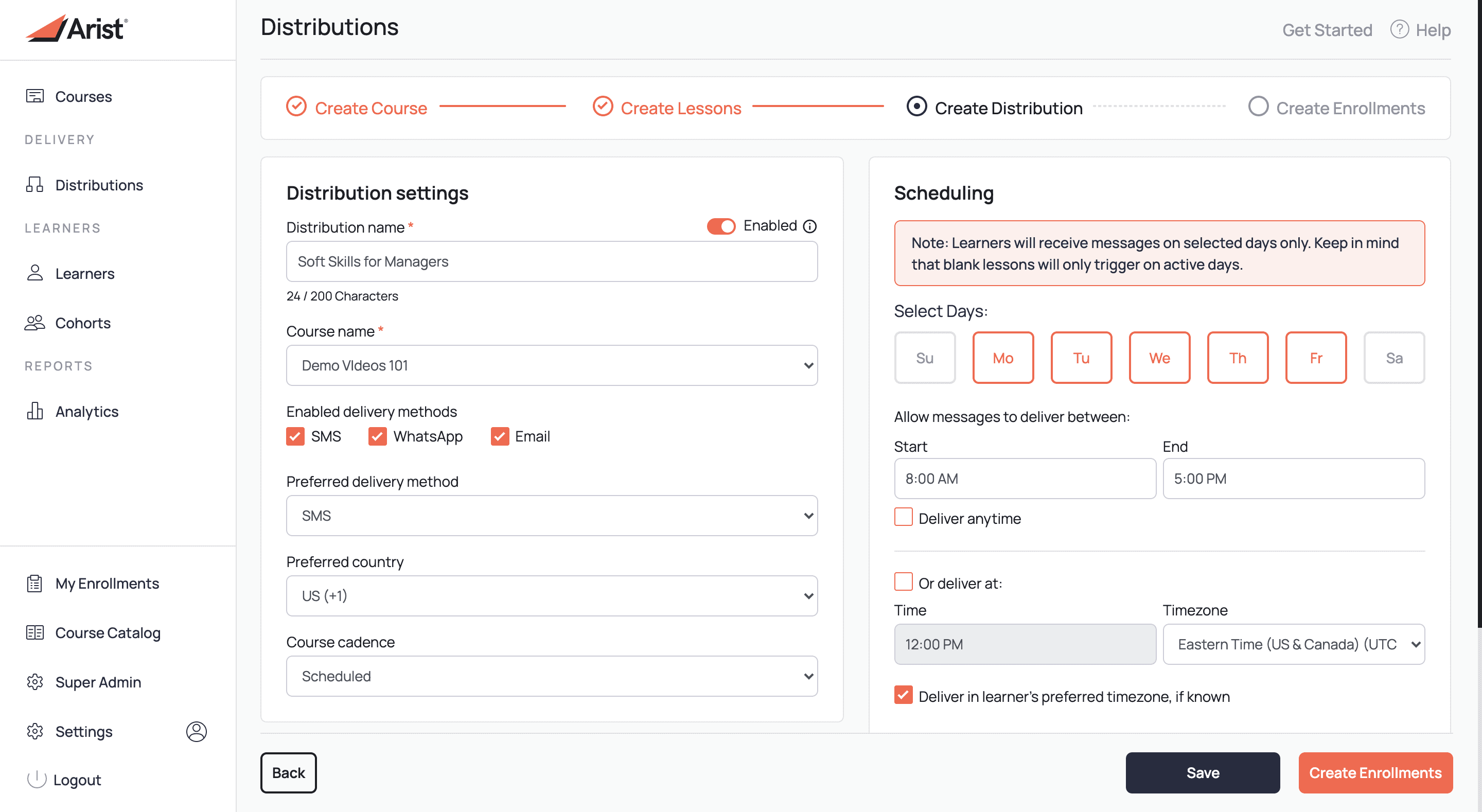
A distribution are the settings applied to delivered courses (for example, scheduling)
An enrollment is a learner who is signed up for a course through a distribution
A template course is a pre-built 5-lesson learning experience that learning teams can utilize out-of-the-box, borrow from, or edit and deliver
Effective context clues
Performance change at scale is a beautiful thing (we’re biased), so our largest context clue for learning teams centers around an aesthetic overhaul for the platform.
Along with recent performance increases, we aim to make our interface an informative space where learning designers and managers can perform at their most creative and analytical levels. No fumbling for the right tab. No troubleshooting for where to input information. Simply clarity in creation, delivery, and analysis of quality continuous learning.

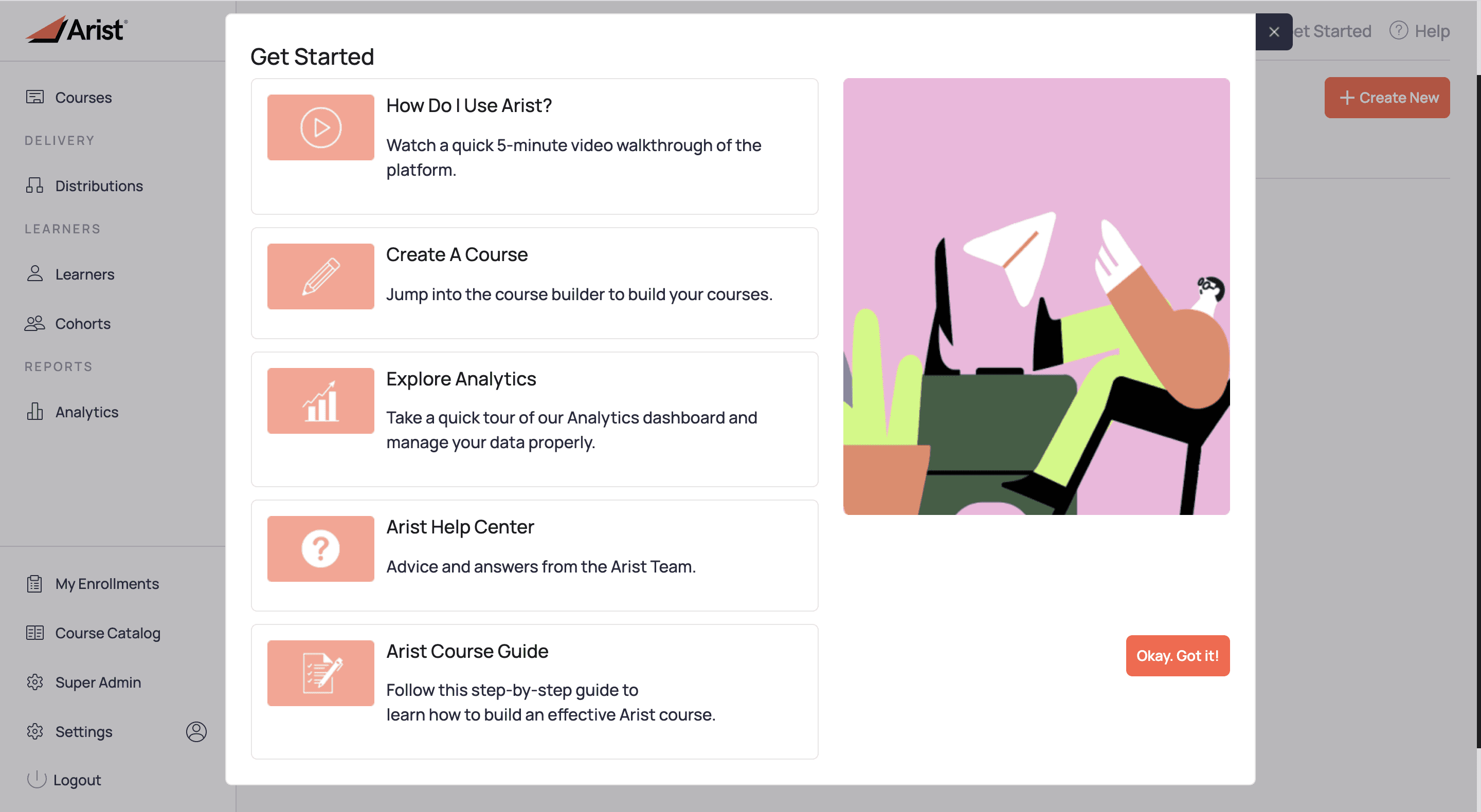
When you first boot up the revamped Arist experience you’ll be greeted with a welcome journey lightbox. These resources always reflect the latest status of the platform and are a great reminder to stay familiarized with the platform.

Within the most common workflows in the app, we’ve also made it more visually clear where you’re at in the process.
All core functionality has remained in the platform. If you’re looking for a more seldom used functionality, look in bottom of the left side menu or in "Get Started" in the upper right.
Logical separation of tasks
In our latest redesign of the Arist platform, we’ve more clearly communicated and separated the distinct actions learning teams tend to take on our platform.
In particular, we pull out:
Course creation and management
Course delivery and distributions
Management of individual learners and learning cohorts
Reporting and learner analytics
Separation of these workflows within the interface supports mindful and well structured learning campaign creation, delivery, and reporting.
As with all changes to our microlearning platform, we based our design decisions on feedback from our core users and ways in which we’re seeing our platform utilized to it’s full potential.
Learn More
Log in to the Arist App
Request a walkthrough from our sales team
Merrill Cook
Bring
real impact
to your people
We care about solving meaningful problems and being thought partners first and foremost. Arist is used and loved by the Fortune 500 — and we'd love to support your goals.
Curious to get a demo or free trial? We'd love to chat:


